The US labor market is much weaker than we have been told
The US employment data does not look so bright when we read beyond the headlines
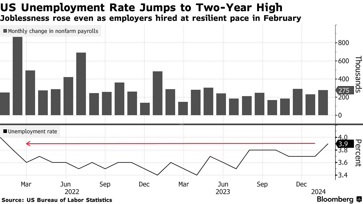
On Friday, March 8, the US Bureau of Labor Statistics released another monthly labor market data that beat Wall Street economists’ expectations. Nonfarm payrolls in February rose by 275,000, more than the 200,000 median estimate. On the other hand, the unemployment rate unexpectedly increased to 3.9%, the highest level in two years versus expectations of staying at 3.7%.
As you can see on the above chart, over the last couple of years the US labor market has seen a consistently high monthly job creation of around 200,000 or more along with low unemployment. On the surface, everything looks bright and almost perfect - not too weak, not too hot. The issue is that the reality looks completely different and this ‘official’ BLS data has been fooling many market watchers, investors, ordinary people, and policymakers. Having said that, let’s dig deeper into the US labor market data by going largely beyond the headlines.
REVISIONS, PART-TIME JOBS, AND MULTIPLE JOBHOLDERS
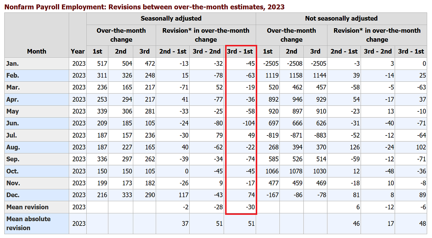
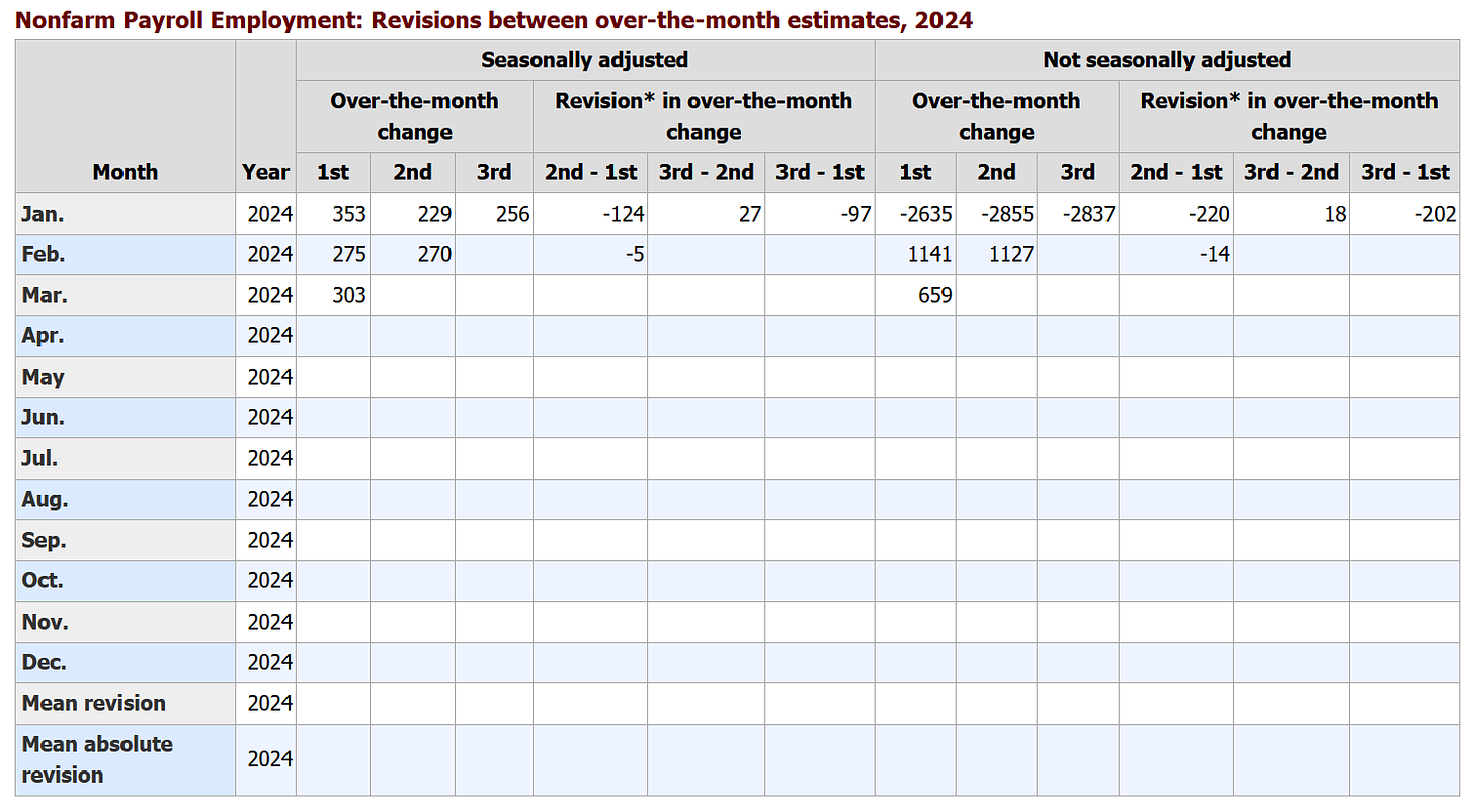
The first and one of the most pronounced arguments that this job market resilience is fake are revisions. For instance, the January payrolls were revised lower by ~35% to 229,000 from 353,000, November from 199,000 to 173,000, and October from 150,000 to 105,000. Overall, 11 of the last 13 months have been revised downward. Moreover, when excluding government vacancies, 11 out of 12 months in 2023 were revised lower, the most revisions since 2008, the Great Financial Crisis.
Thus initially, the BLS provides upbeat data which usually comes in above average estimates and as a result, the market rallies (stocks, bonds, and gold up with bond yields down), then subsequently revises them lower after a month after everything settles.
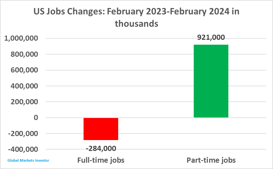
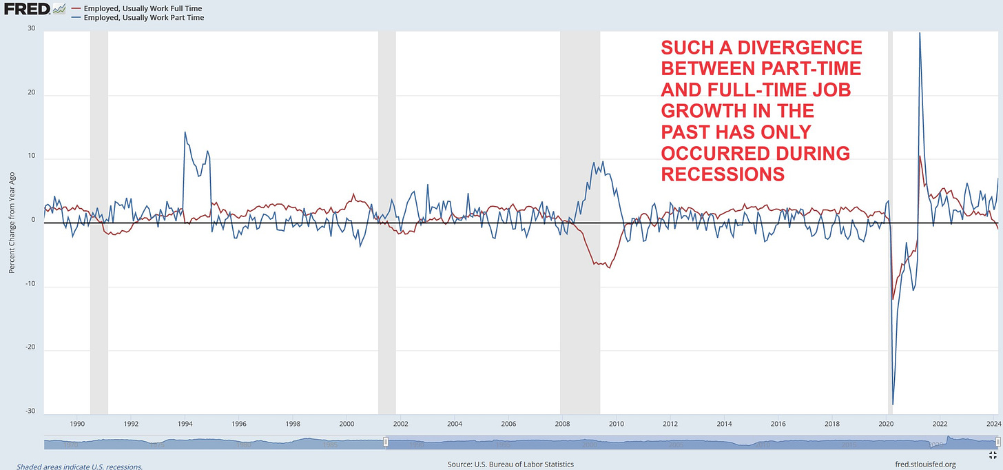
The next important point which has to be laid out is the number of part-time and full-time workers. According to the BLS data, in February 2024 there were 27.9 million part-time jobs in the US, a 921,000 increase from 27.0 million in February 2023. At the same time, the full-time jobs count declined by 284,000 from 133.23 million to 132.95 million. Moreover, as shown in the second table (blue color frames), since November 2023, the US economy has lost 1.8 million full-time jobs. In other words, all jobs created in the past year have been part-time though the headlines say that the US has been adding jobs for 38 straight months.
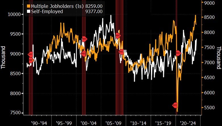
Lastly in this section, there’s a need to mention the number of multiple jobholders. As you can see in the above table, 8,259,000 people held multiple jobs as of the end of February, 5.1% of the total employed, up from 7,883,000 or 4.9% of the total employed last year. As presented by the orange line below these are the highest levels in decades when excluding 2019.
Such a large number of people holding multiple jobs is likely due to the hardship households have been encountering in maintaining their living standards as a result of higher costs (inflation) and interest rates.
To sum this up, in a strong economy full-time workers should be increasing and in turn, the count of part-time workers as well as those holding multiple jobs, should be falling. Currently, the opposite is true which is a very concerning trend for the largest economy in the world, especially for the US consumer because this creates and deepens financial issues for US households which in effect will translate to lower spending.
ESTABLISHMENT VS HOUSEHOLD SURVEY
Each month the BLS provides two surveys that measure employment levels and their trends: the Current Population Survey (CPS), or the household survey, and the Current Employment Statistics (CES) survey, or the establishment survey.
According to BLS, “Employment estimates from the payroll survey are a count of jobs, while the household survey provides an estimate of the number of employed people. If a person changes jobs and is on the payrolls of two employers during the same reference period, both jobs would be counted in the payroll survey estimates.”
In other words, the establishment survey (this is the non-farm payrolls headline number the BLS releases each month) double or triple counts jobs held by the same person, and the household survey shows the number of people who actually have jobs. Therefore, we can say that the latter is a more accurate measure and shows the real employment picture in the United States.
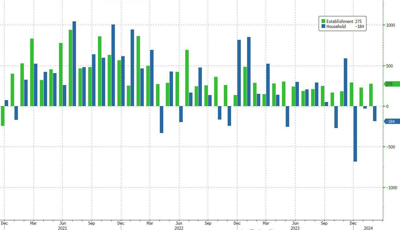
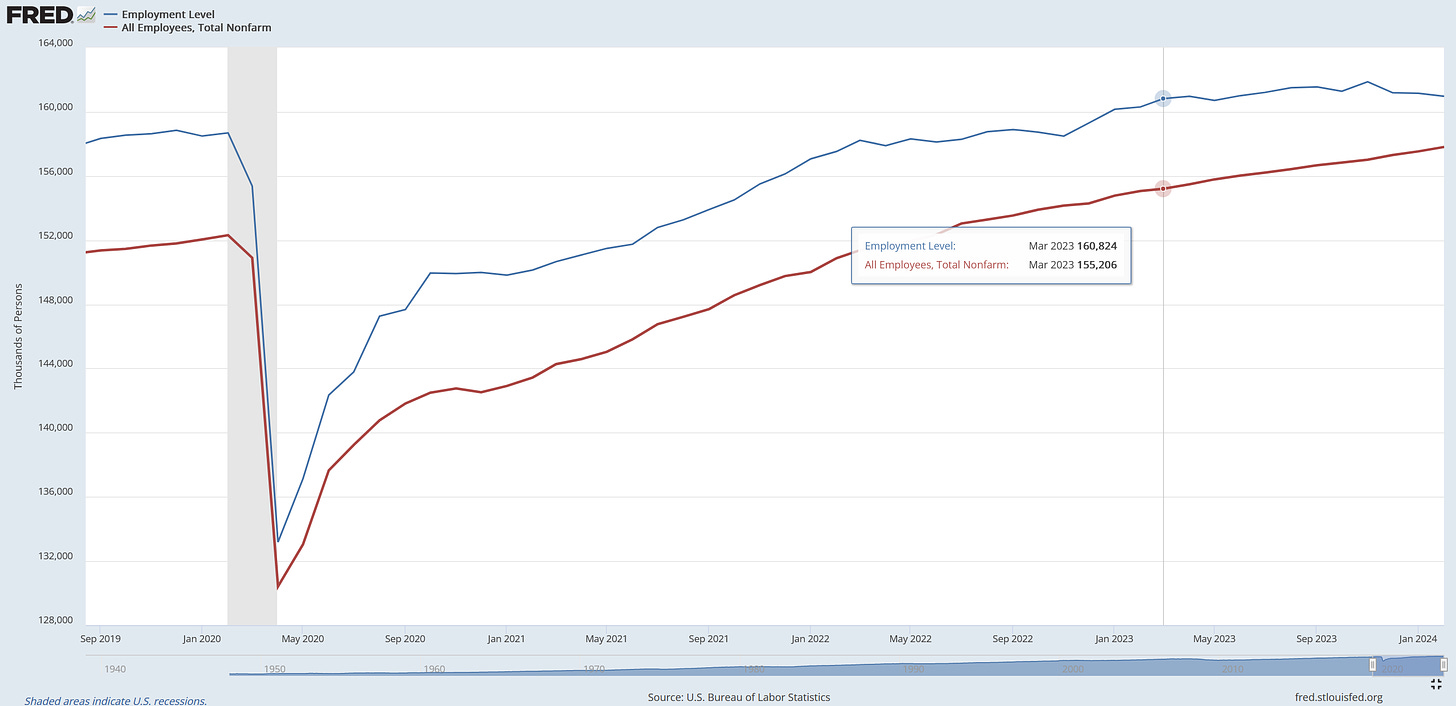
Now, that we know what is the difference between the two we can analyze the data. As we can see on the graph below, the headline non-farm payrolls showed 275,000 jobs created in February but in reality, 184,000 people lost their jobs that month (down from 161,152,000 to 160,968,000). Moreover, the employed workers count declined in 4 out of 5 past months, and three months straight.
Finally, since March 2023, it looks like the household survey (blue line) has barely seen any job growth (150,000 newly employed people in 11 months), while the establishment survey (red line) has shown roughly 2.5 million job creation.
The difference is pretty significant and proves that the overall picture is not as bright as the main headlines have been showing. At this point, it is crucial to remember that the unemployment rate is calculated from the household survey, therefore it might be better to look at this measure than at the non-farm payrolls count when analyzing the headlines.
FOOD FOR THOUGHT - NATIVE VS FOREIGN BORN
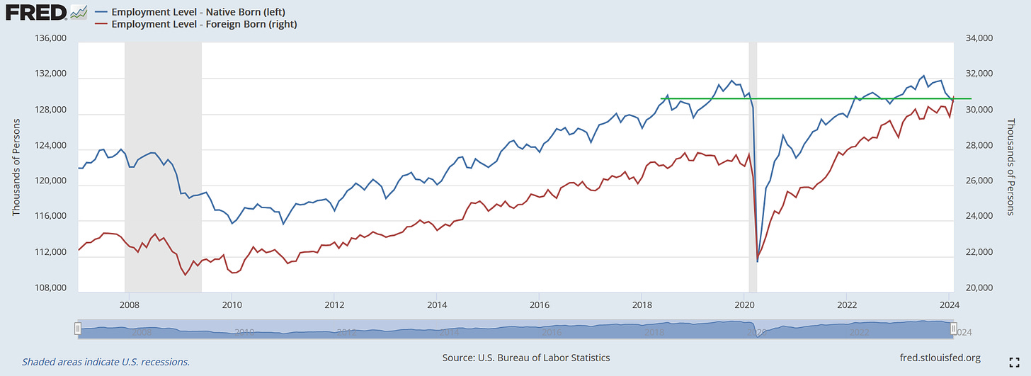
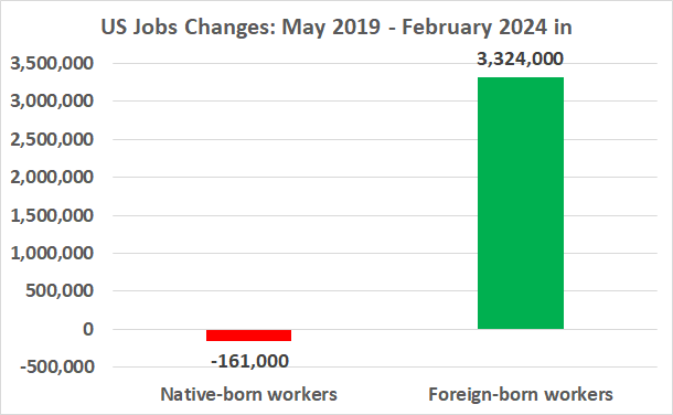
In drawing things to a close, when looking deeper into the labor market data we can see a large difference between native-born and foreign-born employment creation. The most recent data shows that in February 560,000 native-born workers lost their jobs, and 2.4 million in the past 3 months, the most since the pandemic crisis. On the other hand, 1.2 million foreign-born workers were added in February, the highest monthly addition ever.
Furthermore, since May 2019, 161,000 native-born workers lost their jobs versus more than 3 million foreign-born workers that have been added.
To conclude this short section, in the past few years, the labor force participation and more importantly the US job creation have been entirely driven by immigrants. What is even more surprising it appears that the native-born employment level has never fully recovered from the pandemic.
SUMMARY
There are many inconsistencies and details within the US labor market data which makes things a little bit convoluted. The key takeaway from the above analysis is that the employment data has not been as great as we have been told. In regards to the numbers, we may want to remember that despite the non-farm payrolls showing 275,000 jobs created in February, in reality, 184,000 people lost their jobs.
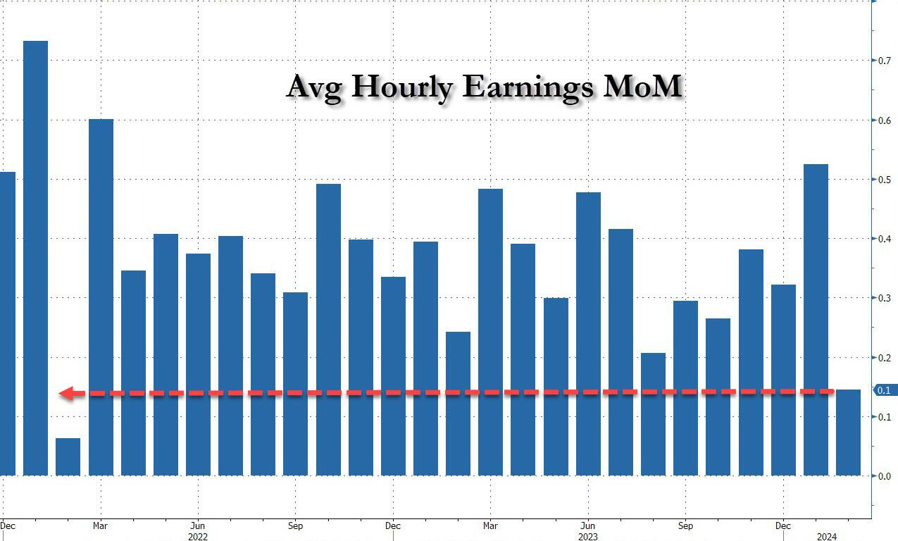
The Fed is well aware of all those misconceptions and under-the-surface data weaknesses. Despite that, it will still be looking at the main headlines of non-farm payrolls count, unemployment rate, and average hourly earnings when contemplating their future monetary policy decisions. And if the data will continue to show the seeming resilience of the US labor market (with inflation not coming back to the 2% target) this will provide the policymakers an excuse to continue shrinking the central bank’s balance sheet and delaying the rate cuts.
By the way, in terms of the real (adjusted for inflation) average hourly earnings in the US (first chart below), they are still below the April 2020 high but also 2021 and 2022 levels despite nominally rising each month (second chart below). In other words, earnings have been growing consistently, but when we adjust the data for inflation they are much weaker. Again, the devil is in the details.
MARCH UPDATE (data released on April 5, 2024)
US March Nonfarm Payrolls came at 303,000 beating expectations of 214,000 and the Unemployment Rate dropped to 3.8% from 3.9%.
However, when digging again into the US household survey data we can see that the US labor market lost 1.8 million full-time jobs from November to March.
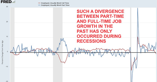
Moreover, in the last 12 months, full-time jobs declined by 1.4 million or by 1% year over year while part-time jobs rose by 1.9 million or by 7% year over year.
In the past, such a divergence between full-time and part-time job growth has only occurred during recessions (gray areas) as shown in the below chart.
It means that 13 of the last 14 months have been revised downward.
And again, when excluding government vacancies, 11 out of 12 months in 2023 were revised lower, the most revisions since 2008, the Great Financial Crisis.
If you find it informative and helpful you may consider buying me a coffee and follow me on Twitter:






I've been shaking my head for a while now and I must say this piece seems to validate what two of my 5 senses (smell & vision) have been picking up. Sooner or later something has to give.
How do these numbers jibe with the Covid death rates? And Long Covid rates?